
 As was reported a few days ago, artist Greg Martin passed away in May of last year, under the radar of those who obsess over the smallest details involved in the Sonic franchise. Responsible for nearly ever major Sonic the Hedgehog cover in the west through 1995, along with a slew of promotional art, his was the image of Sonic kids across the western world grew to know and love. Who didn’t have that Are You Up 2 It? poster taped to the back of their bedroom door? Who didn’t stare obsessively at ads for Sonic CD, seeing Sonic grabbing that Time Stone out of Metal Sonic’s reach, and plot for hours on end how’d they convince their parents to buy them a Sega CD?
Some time back, Sonic Retro forum member Buyatari was able to purchase a slew of line art from the man himself, and has recently scanned them for all on the Internet to see. We tip our hat to you, for without your efforts, who knows if any of these would have seen the light of day again?
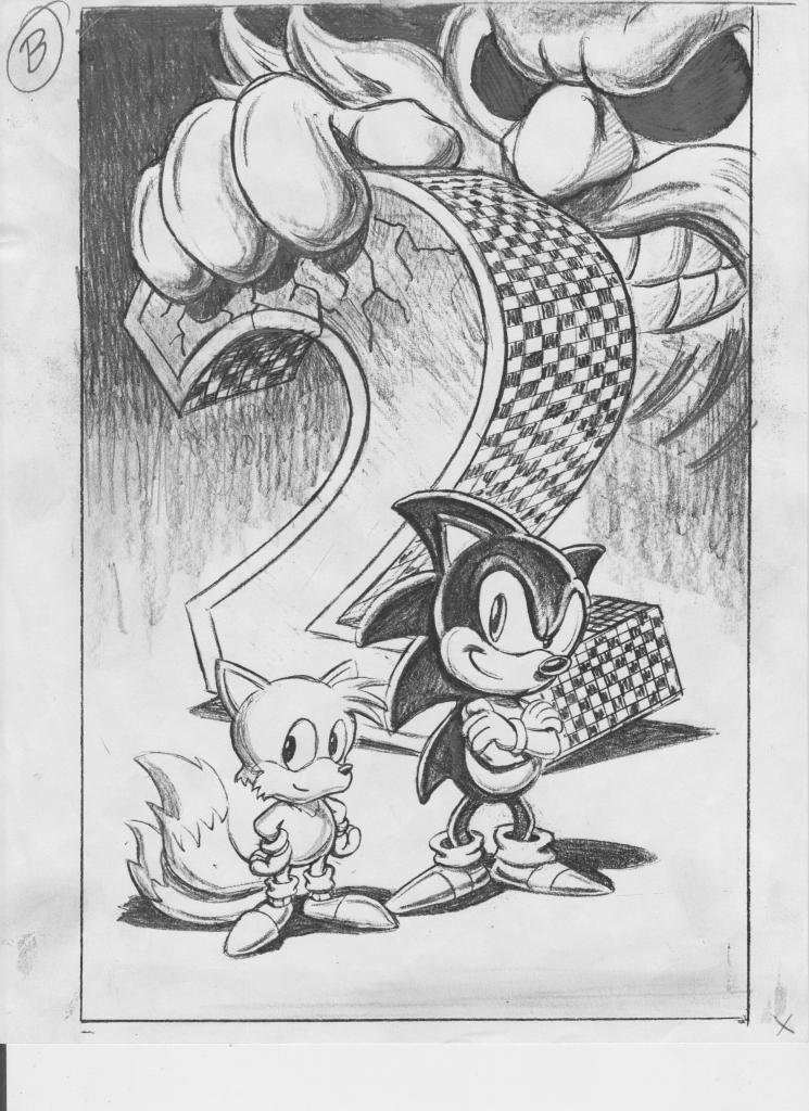
Among the sketches is the iconic cover to Sonic the Hedgehog 2, which has been burned into everyone’s retinas by this point, and for good reason. The just as iconic image of Sonic standing in the Green Hill Zone is here too, which would be used for the cover to the promotional comic shoved in issues of Disney Adventures. There’s also an early version of Sonic Chaos‘ cover, with a spring-less Sonic and a quite worried Tails, instead of the super-happy fox we’d see on the final. Rounding out the collection are a couple of images aren’t immediately recognizable, including an image of Sonic and Knuckles ready to duke it out in the Mushroom Hill Zone. Perhaps an unused cover for Sonic & Knuckles? Who knows. Regardless, it’s a fascinating look at the process to a man who should have gotten far more credit than he did, not just for this work on Sonic but his other Sega video game covers, not to mention Namco, Hudson, Capcom, and even VHS covers to the Teenage Mutant Ninja Turtles. This man controlled our childhood in the late 80’s and early 90’s, and for that reason, we should honor him.
12 Comments
RIP Greg.
There’ll never be another one like you.
SEGA should retire Assface Sonic in memory of Greg.
Him being behind so many late 80’s to 90’s covers really gave that era of gaming a real identity beyond the game’s themselves.
“SEGA should retire Assface Sonic in memory of Greg.”
I think you meant to say that they should bring back Assface in memory of Greg.
You shouldn’t call him “Assface”, that’s very rude and disrespectful to the artist who had passed away. His art was like no other, he was truly a legend who had a heart of gold and will be missed dearly.
Assface never left though, the SA redesign carried over the buttcheek looking brow SOA’s Sonic is famous for. The modern CG makes it look pretty hideous thanks to their obsession with realism over style.
The funny thing is it does show up in some of Ohshima’s concept art when Sonic has a determined look on his and the title screen to the original game, SOA ran with this as the default look while SOJ’s art avoids it after that game.
Anyone else noticed that reflection of Sonic on the promo cover? Talk about attention to detail. Too bad it was left out of the finished drawing.
Those artworks are pretty nice. I wish they had used that scrapped MHZ artwork on the American S&K cover, I always hated how it had no box art whatsoever.
I have to ask, though, how come that Robotnik seems to have a beard in the Sonic 2 artwork? And why on Earth does Knuckles have Sonic’s eyes on the Sonic 3 one? Those parts always bugged me.
Pity that SoA forced Greg to use the craptastic AoSTH Robotnik in his latest artworks. Not that the American Robotnik design used prior to that was that great, but at least it didn’t look THAT goofy and ugly.
I find curious that 11th pic depicting a generic Sonic looks much closer to his Japanese design (he doesn’t seem to have a mohawk, his body trunk is spherical, and his shows look the same as they do in the Japanese artwork). I wonder what was the reason for the change? Maybe he got better at drawing Sonic by that point so he could more closely mimic the Japanese artwork? Or maybe he wanted to try a different style, and based it on the Japanese illustrations? Either way, I think that’s the best Sonic has looked when drawn by Greg. Not that his regular Sonic drawings looked bad at all, but I like the “cleaner” (for lack of a better word) Japanese design better.
Show a little respect why don’t ya.
Nothing about his comment was disrespectful.
That 9th sketch surely looks like it would fit nicely to cover of Sonic 3 Complete if it ever came out. (Due to showing both Tails and Mushroom Hill Zone)
Unless it was used as a cover for whatever Sonic book is out there.
I have the Taz-Mania cartridge, and the art is great. nothing like sonics goofy american design.
Im trying to create art exactly like greg martin. Im very focused on achieving this look. Does anybody know how he did this and what materials he used? What paper did he use? I read somewhere he used acrylic paint. Is that accurate?